Category Archives: Uncategorized

The Lobster has me STYMIED

Standard

So.  Those of you that know me know I was born and raised in the mid-west.  Kansas to be exact.  THE FARTHEST PLACE ONE CAN GET FROM AN  OCEAN IN OUR COUNTRY.  Seriously.  So, when this stamp set, By the Tide, was selected, I had a miniature panic attack.  Cause what the heck do I do with a lobster.  I have no idea how to eat them, prepare them, or even how to ORDER them.  I’m not even sure I’ve had lobster… probably have, especially at some buffet or something like that, but I don’t recall…..  And, until I moved to Hawaii and actually had REAL fish, I thought I hated all seafood (cause all I had to compare it to was catfish…which, if you like catfish, my apologies for the offense.  I, however, do not like it.  not one bit.)

ANYWAY, so I had to do something with a lobster.  I realize there are other stamps in this set, but I had to make it a personal goal of mine to make something with a lobster.  LOBSTER.  WHAT DO YOU DO WITH A LOBSTER?????  Looking at my favorite inspiration sites (aka pinterest) I found lots of New-England Coastal scene.  Which was really nice… BUT, I am also unfamiliar with that TOO.  Remember.  Kansas.  Not New England.

So, I made it a point to do something unexpected with a lobster.  And, my first thought was to pair it with melon mambo.  Cause I didn’t see ANY of that color on the pinterest search.  And, this is what I came up with.

20130511_090713


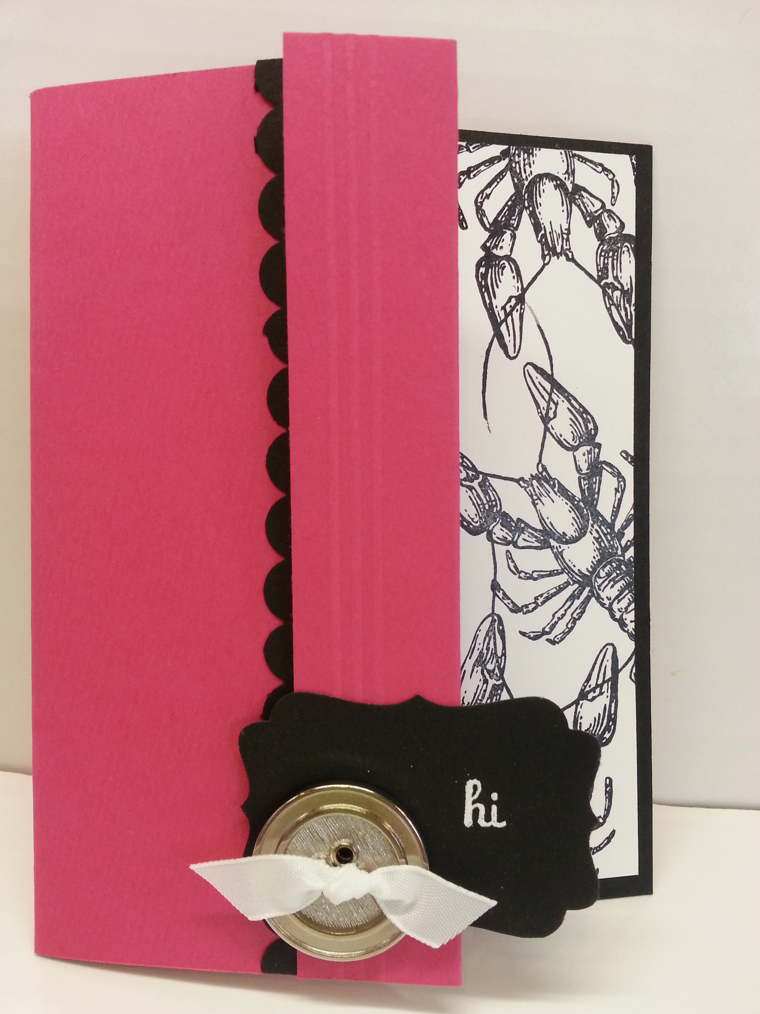
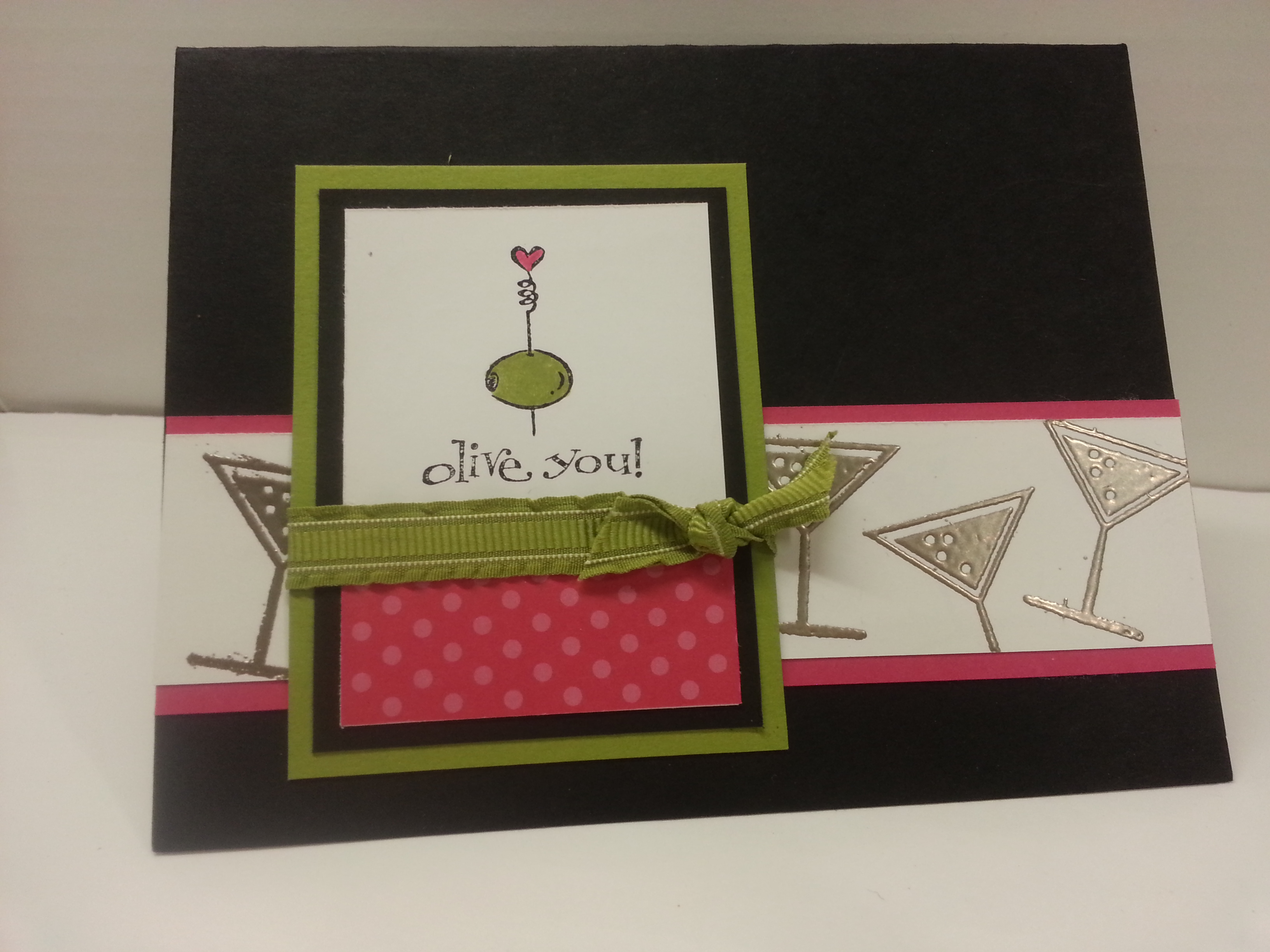
An IN YOUR FACE PINK AND BLACK (melon mambo and basic black) card with LOBSTERS.  Cause you wanna make a statement.  Send this card and I guarantee you will get a phone call… asking what do the lobsters mean?  So, here’s your chance to come up with something  REALLY funny.  Or just simply say, “they were to get you to call!!!”  Cause what do you do with a LOBSTER.  (I’ve polled several people, and the only answer I got was to EAT it.  Hum… )


20130511_090802


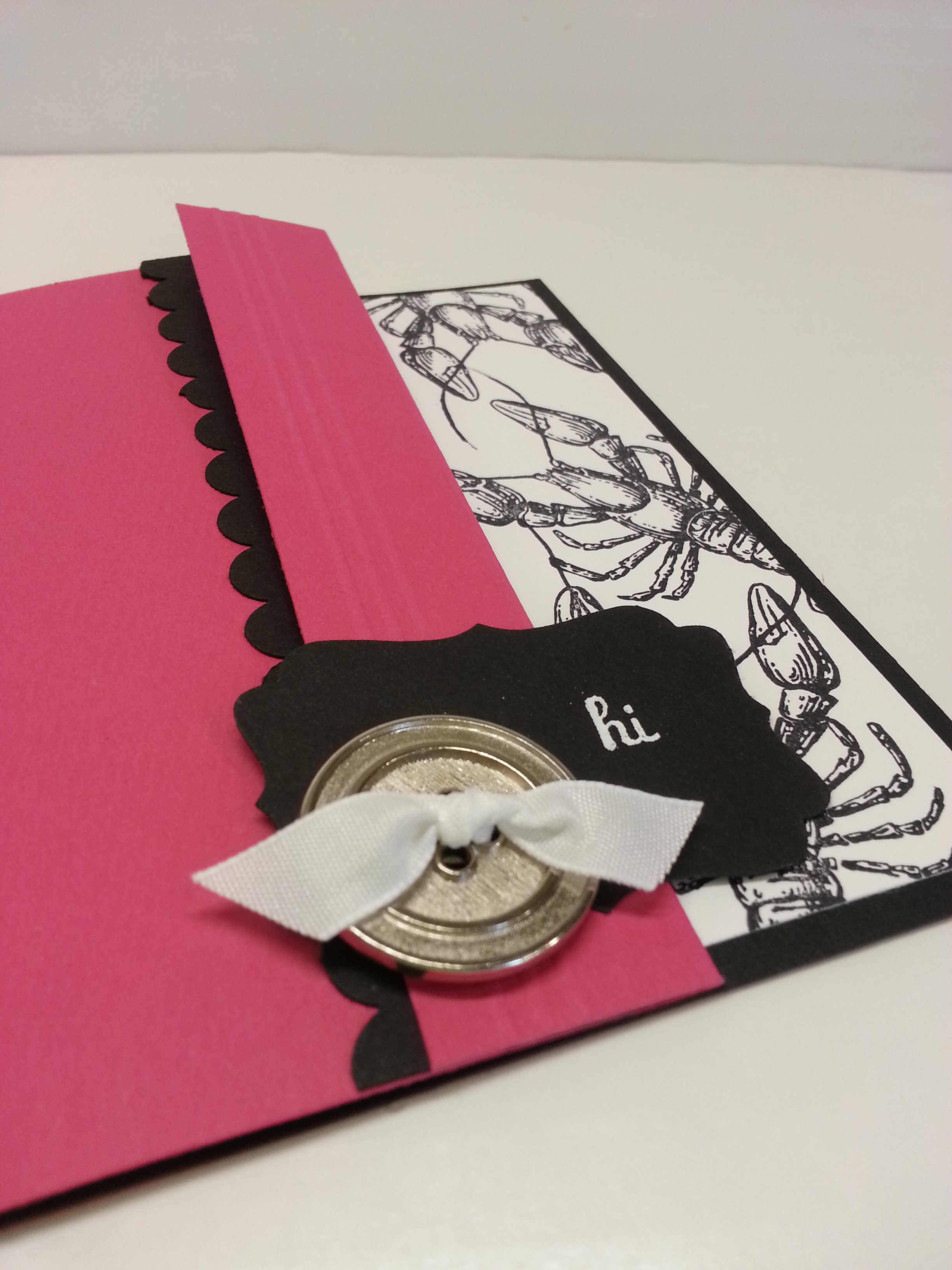
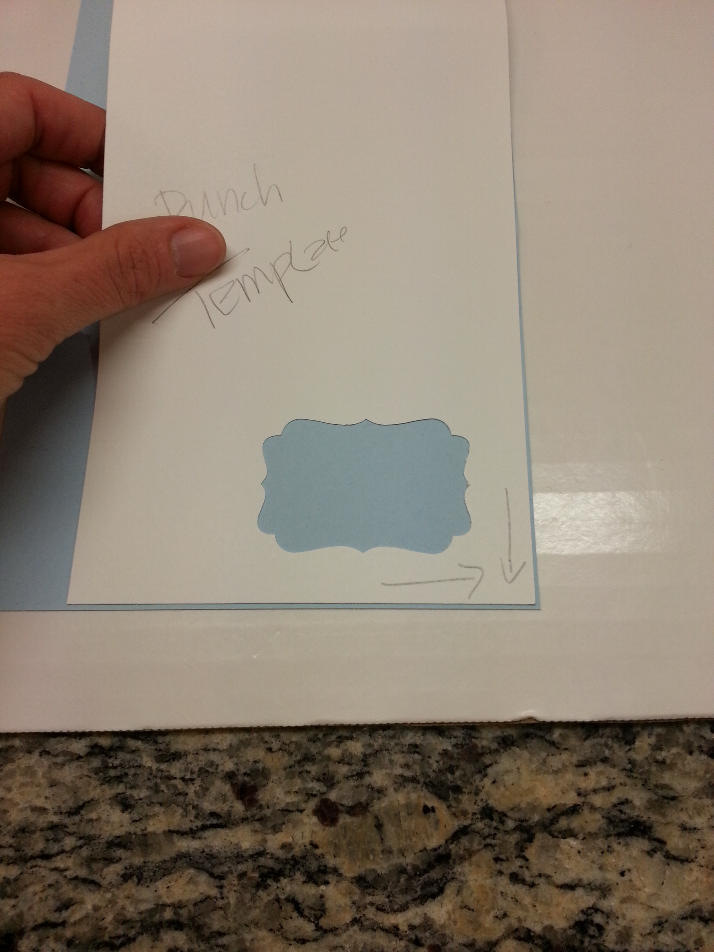
So, here are some details on how to make the card.  The card base is made from melon mambo.  I cut basic black and whisper white panels to go on the inside.  Then folded a portion of the melon mambo front over.  I think I trimmed off about 1/2″ inch too, just to make it a little smaller.  Can you see the 3 scored lines?  Stampin’ Score.  Makes it SUPER easy to do neat scoring texture.  I added a scallop trim border.  Those buttons… those are the silver Basic Designer Buttons (item 129325 for $5.95) from the Spring Occasions Catalog.  I love those buttons.  And, you only have till May 31 to get them….  (or anything else in the Spring Occasions catalog you might want)  I added a little of the taffeta white ribbon on the button, embossed the word HI (from Fabulous Phrases set, 120501) onto the curly label punch.  And, that it it.


This next card was a little easier… in the sense of making something with the other images from the stamp set.  And, despite my resolution to try and NOT tempt you with the new colors going to be released, I did not have the willpower to do so.  WHAT YOU ARE SEEING HERE ARE SOME OF THE NEW COLORS.  Aren’t you LOVING them?  And now mad at me for showing them to you and making you wait until June 1 to buy??

20130511_090816

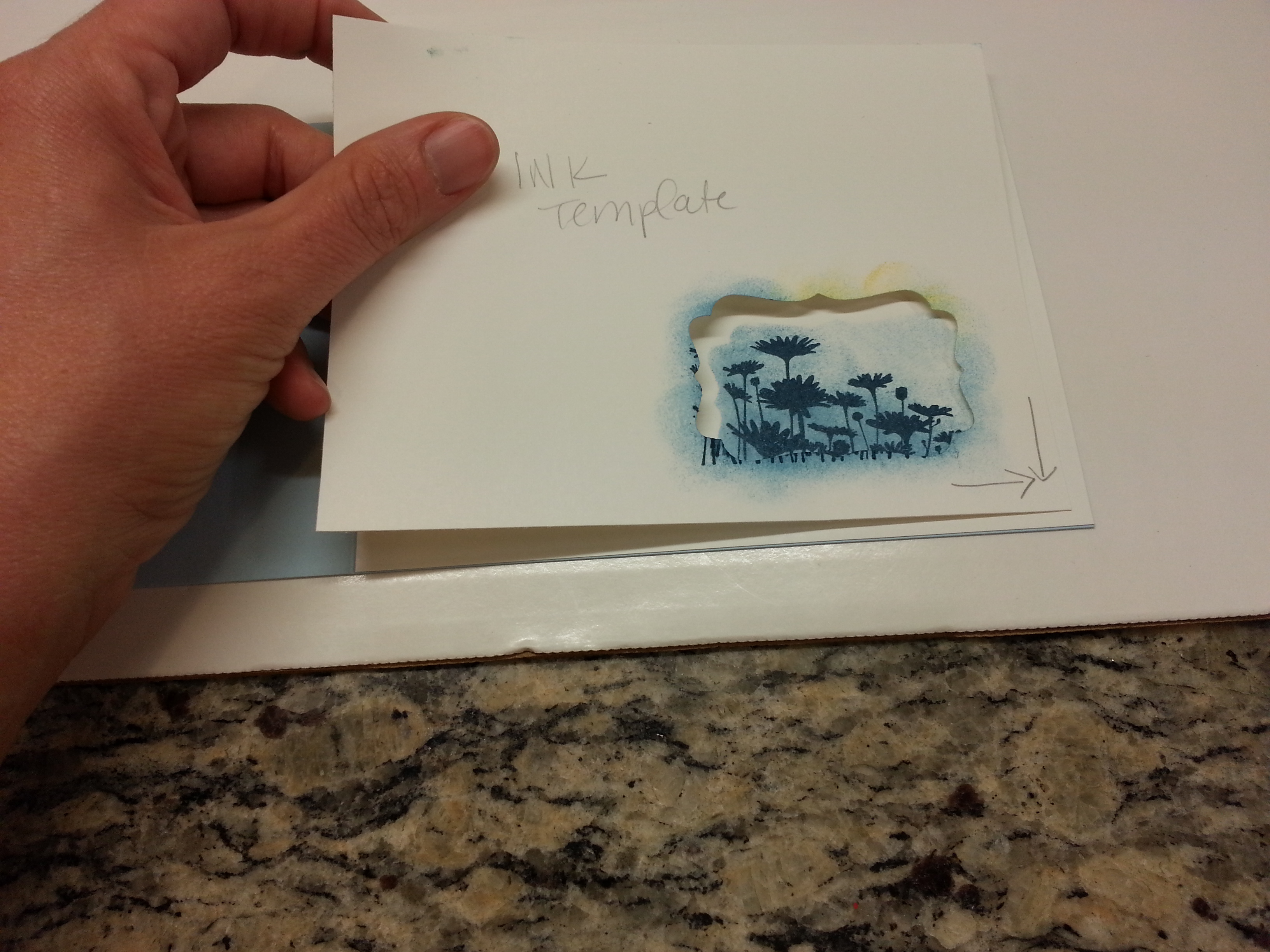
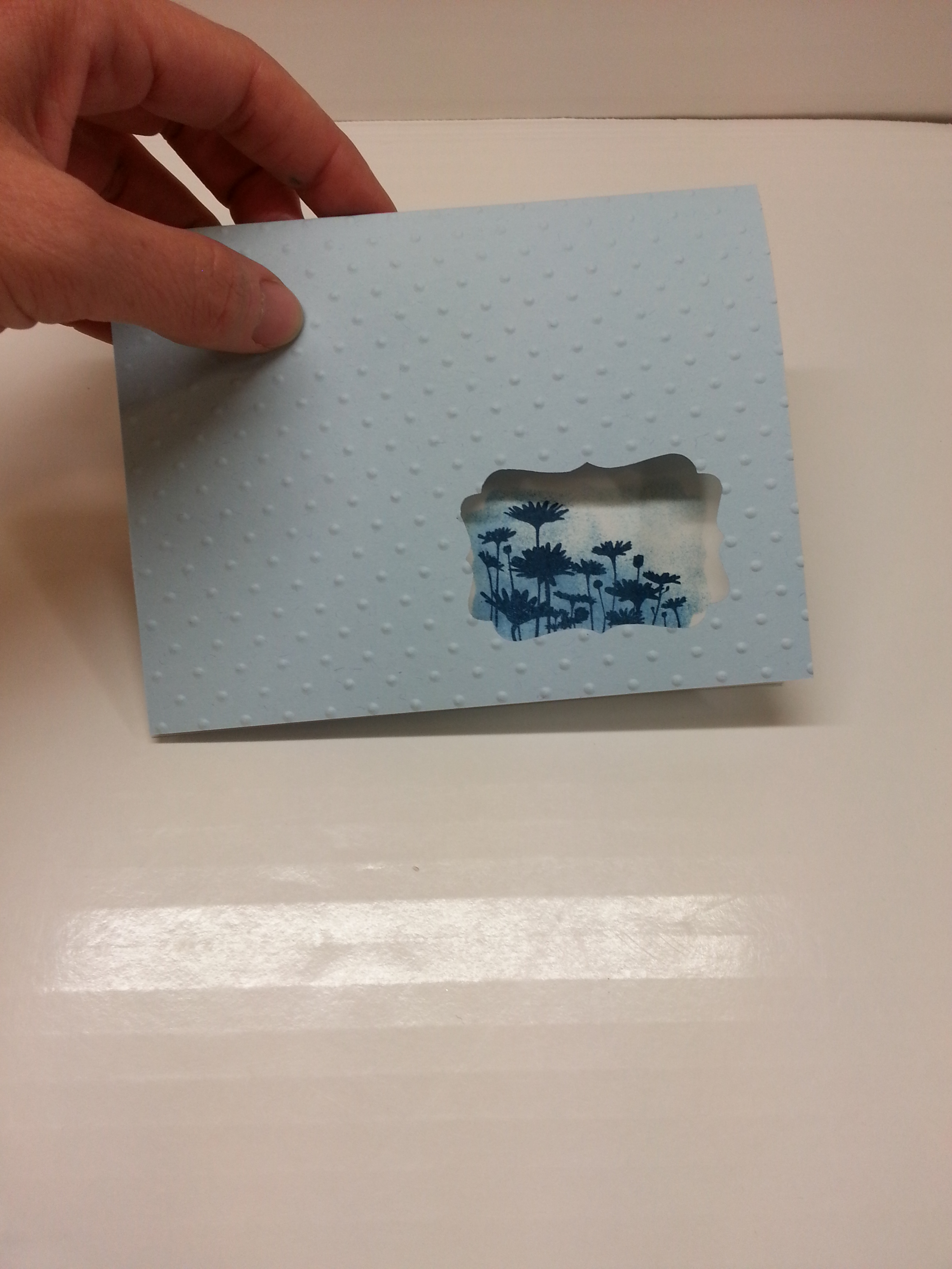
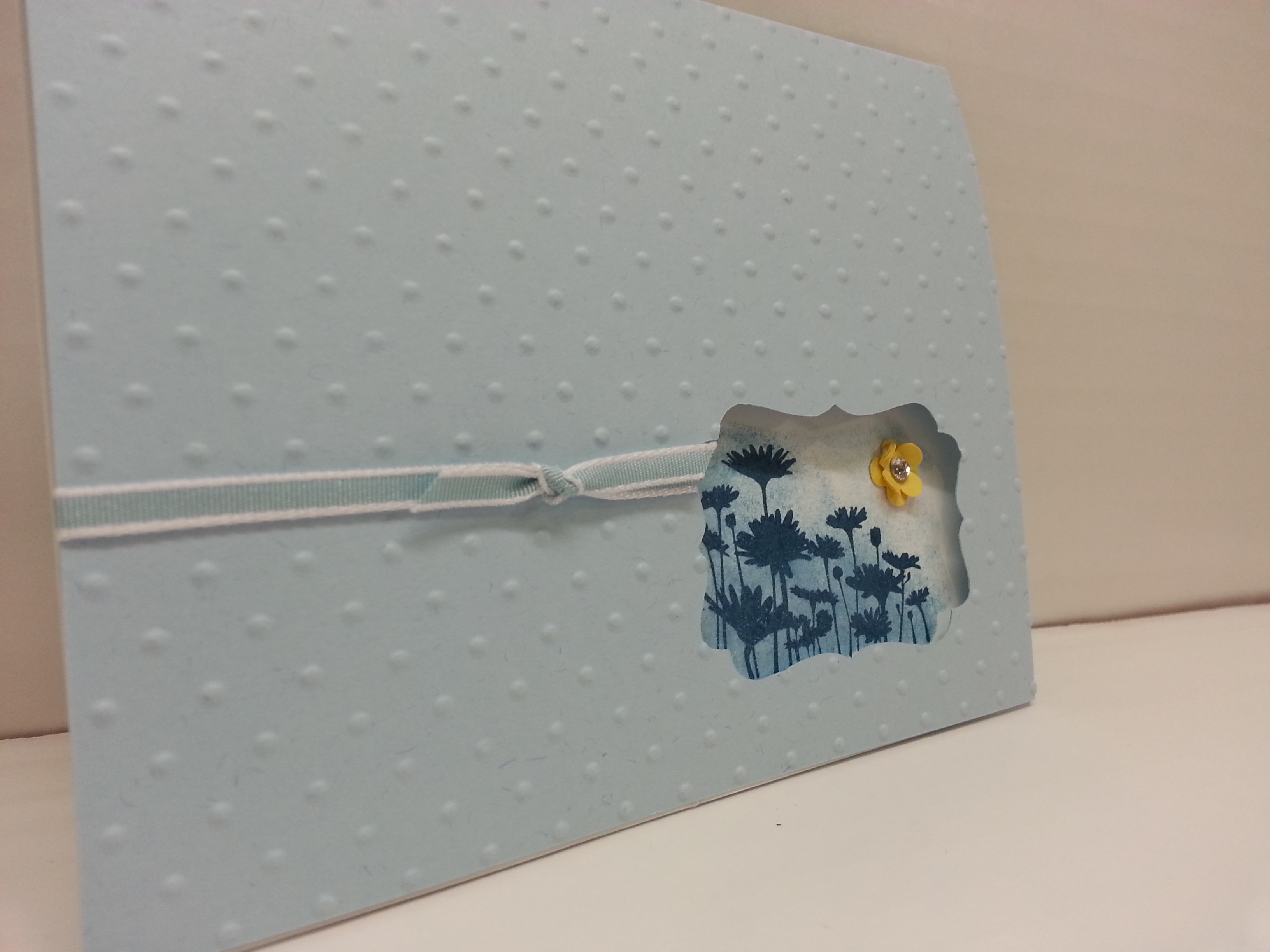
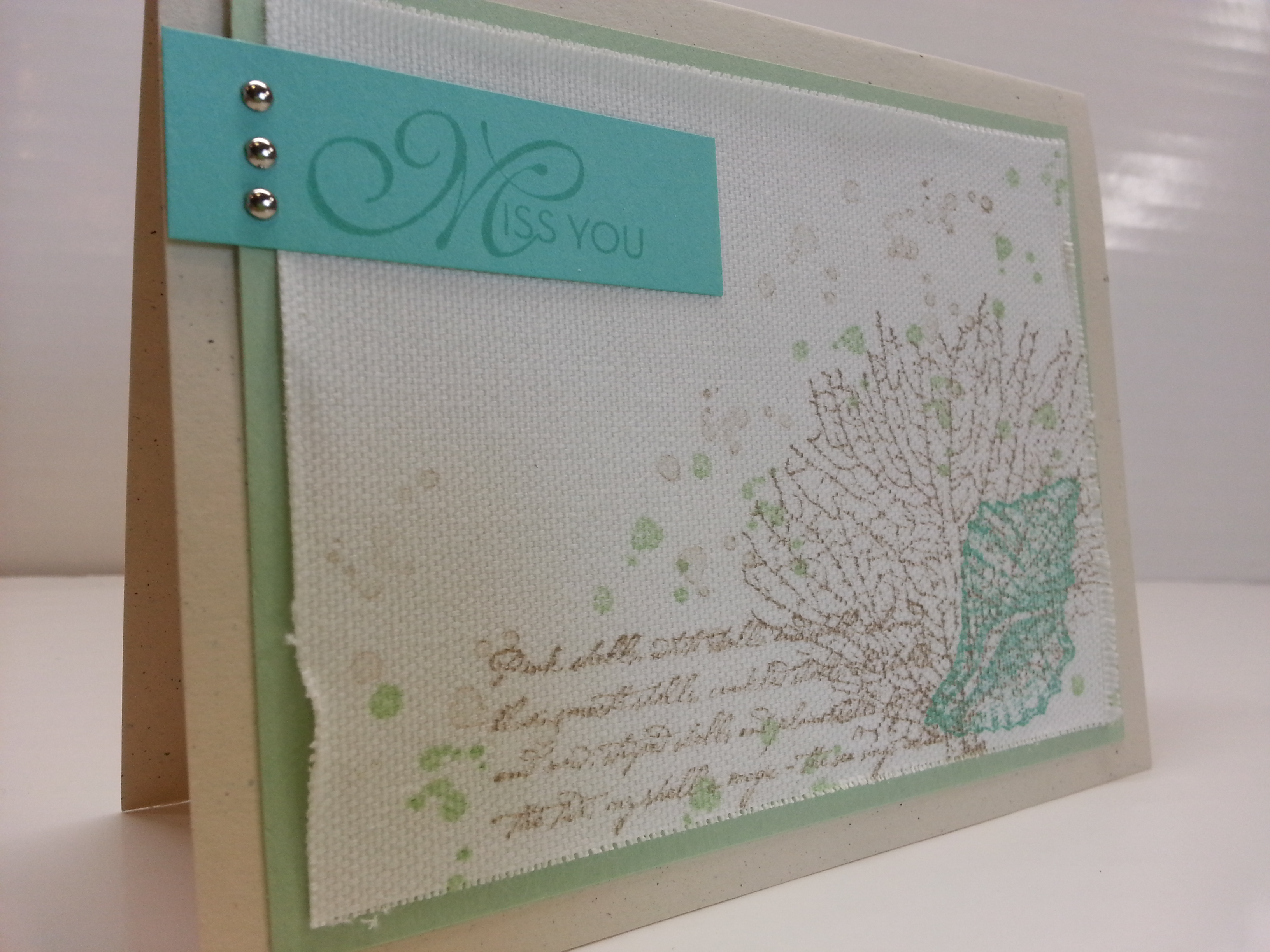
The card base for this was naturals ivory.  It has a very earthy feel.  And, then I used Pistachio Pudding as the pale green layer and Coastal Cabana as the brighter green that has the “Miss You” stamp.  And the seashell stamp.  Brown Sugar ink was used for the wording stamps and crumb cake for the seaweed plant.  Those spots… that was a stamp from the My Paper Pumpkin Welcome Kit.  Which is marvelous.


20130511_090854

Can you see the texture on this?  I used that canvas creations paper.  (item 129375)  Which is really not paper.  It’s kind-of a cross between paper and canvas… but really more canvas.  Maybe it is.   Who knows.  It doesn’t have the rigidity of paper… when you take it out of the package it definitely flops about.  But, it can be easily cut on the trimmer.  And, I love it cause you can fray the edges… just pull out some of the fibers.  There seem to be two different surfaces…one definitely has more texture than the other.  I used the more texture one.  I love it…gives a very earthy feel (I’m using that term for lack of a better word….)  I don’t FEEL very well right now, some cold that’s been going around.  Which I’m sure is why I’m having a more difficult time than normal figuring out something appropriate to do with lobsters…and figuring out the correct vocabulary to use for describing what I am trying to say…

20130511_090831

I love the new colors, both the in-colors and the color refresh SU is doing.  It will definitely be lots of fun creating new things with these new products.

20130511_090927


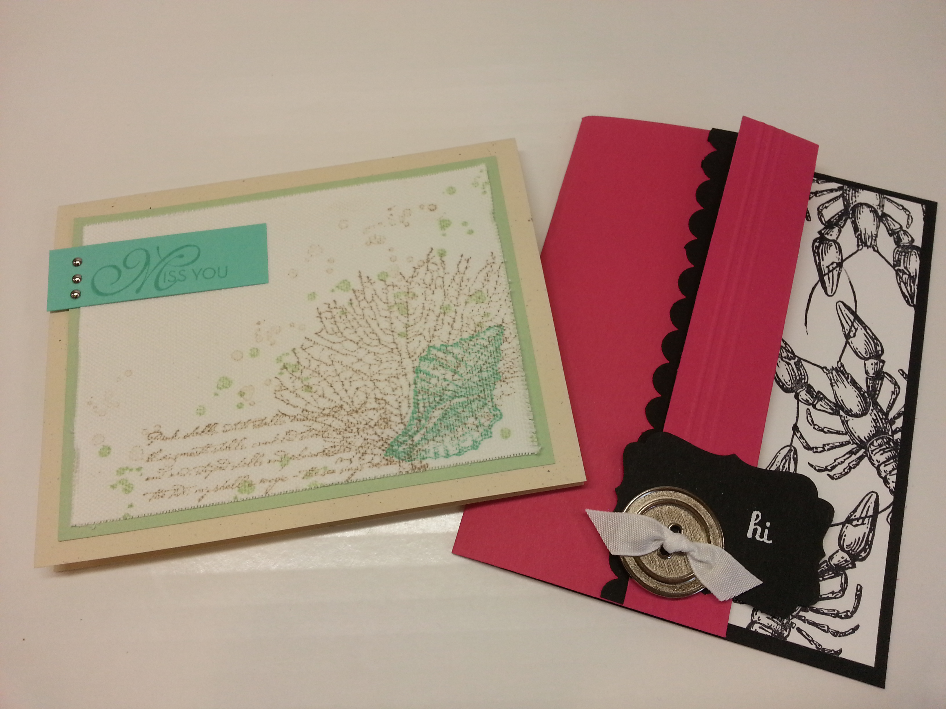
I think I win the prize for having the two most miss-matched cards from the same stamp set.  But, I did that on purpose (snort…).  Shows VERSATILITY.  And, I wouldn’t be anything if I weren’t versatile.     I don’t even know what I am saying.  Methinks it is time for more medication and an nap…..

Enjoy your next stop on the tour.  You’re off to see what Deb Leigh has for  you.  Click on the button below… or if that doesn’t work, there is a list…

blogtour-stampmonth-next


Beautiful Butterflies

Standard

So… I bought the Papillon Potpourri stamp set when this current catalog came out.  And, used it once in my easel calendar class back in December and that was it.  But I LIKE it.  And it makes beautiful cards.  I’m sorry I didn’t use it sooner!!  Image

We did this as one of our April Stamp Club projects.  I love how the big butterfly fits the elegant butterfly punch (and, everyone thought that it was DSP, but it is a stamp–which is great cause it comes in ANY color).  I made this sample as mother’s day (from teeny tiny wishes) but you could add any sentiment.  I wish I could say that I made this idea up, but I didn’t.  I copied it from Krista Fenton.  Pretty much completely copied.  Colors and everything. (I did change some little details…)  She did such a beautiful job, I figured I shouldn’t mess with that!!

Here’s a little closer look:Image

Colors used are Baja Breeze (retiring!!), Summer Starfruit an Elegant Eggplant.  I used the scallop border punch and the Summer Starfruit ribbon to add a little embellishment.  It’s so nice and simple.  The small butterfly punch is from the Spring Occasions Catalog, but it is going to be available in the 2013-14 catalog as well!!  You could make sets of cards like this, with different colors, and change the sentiment.  Yeah, And, I know it is white layered on white.  And, I used to think that it was a huge waste.  And it probably is. But, even in it is subtleness (??), it still gives a VERY nice effect.  And, that makes it all worth it.

AND… The second purpose of this post is to announce to you that Mother’s Day is in 2 weeks.  TWO WEEKS.  So, don’t forget.  You can’t say you weren’t warned.  And, if you need a card, you can make this one.  If you need a gift….well, I can help you there too.  If you order soon, it will come by Mother’s Day.  If you don’t know WHAT to order, you can get a gift certificate from me.  And, let me tell you, as a Mother, I do believe I would LOVE a Stampin’ UP gift certificate…  🙂  If you would like for me to forward the link to this blog to your significant other as a ‘subtle’ reminder that a. it’s mother’s day and b. this is what you should buy…  I’d be happy to do so.  We aim to please…

Anyway……

Best of …PEEK-A-Boo…

Standard

So Hello!!  And welcome back to the BEST OF blog tour…

(and for those of you who have been following me, I survived the hazardous stamping incident from a few days ago…  and, it must have been REAL bad cause the following  morning, I went to school with two different pairs of shoes on…)  HUM.

ANYWAY…  BEST OF FLOWERS!!  Lots of nice flowers here…  And, the flower I use from this stamp set was one of my favorites, until it went into the great stamp beyond…  Glad to see it back!!

20130418_214201

This little flower stamp fits perfectly into the Decorative Label punch..  Makes a nice peek-a-boo window!!

So, it is a little tricky to get it lined up all right, but it’s not too hard to master.  What I did was make a template where I could line up the punch on the front of card with the place I wanted to put a mask for the inside.  I used the corner of the paper to line up the punch…

20130418_212756

When I had the template put on top of the card stock (Oh, which is Bashful Blue… one of the ones we are losing… so sad).  I just traced the inside top of the template with a pencil.  This way, I could see where to punch…

20130418_211840

So, I just put the pencil mark on just the inside of the punch and that will make sure the hole on the front of the card is punched in the right place.

I also made an INK template… It’s same as the punch template, but I didn’t wanna risk transferring ink to the front of the card.  SO…  You glue a white panel inside the card, and line the template up on the corners.  Stamp THROUGH the template hole and sponge.. (I used Midnight Muse for the flowers and bashful blue for the sponging.  Ignore the daffodil on the template… I changed my mind..

20130418_211956

This is what you get:

20130418_212556

And, here it is when it is closed…  Your flowers peek through the window you  made.

20130418_212606

Embellish it up a little bit…I used the bashful blue taffeta ribbon, I used the little four petal flower punch from the Itty Bitty Shapes Punch Pack.  I LOVE that punch.  I put a little DIAMOND (my friend likes to spell it DI-HU-MUNDS…) and WHO DOESN’T LOVE THOSE??  (I suppose legal requirements would propel me to explain that they are not really diamonds, but rhinestones).  STILL BEAUTIFUL.

And, this is what you get!!20130418_214229

and here is a close up of the flower window…

20130418_214212

Oh… I embossed the front of the card with the polka-dot embossing folder!!

Anyway… Hope you enjoyed it…

Click below for the link to the next blogs…  And ENJOY your tour!!

blogtour-25years-next (1)

If that link doesn’t work, here is the list:

The Hazards of Stamping

Standard

So.  I have both my clubs meeting this weekend.  And, it’s Wednesday night.  And, I still have NO idea what they are going to make.  And, I’m trying to put stuff together and nothing is coming and I’m frantically combing pinterest, stampin’ connection, and all my favorite stampin’ bloggers.  Nothing.  Nothing at all.

And, I’m so INVOLVED in scouring these interwebular spectacular inspiration-starters that I don’t notice that my arm has been resting on my staz-on ink pad.  BLACK STAZ-ON INK PAD.  For several minutes.

20130417_203244 (2)


That’s my arm.  With a big, black, permanent rectangle.  And an outline of a rectangle.  I’ve tried to get it off.  But, it didn’t come off.

Tomorrow is gonna be a long-sleeve day.

sigh.


And, if you wanna see if I actually survive my hobby until the weekend, check back THIS SUNDAY for the Next Installment of the BEST OF stamp tour.  This month we will feature ‘Best of Flowers’.


Ode to More Mustard and Riding Hood Red

Standard

Well…  Up until SU posted the color refresh, I knew what stamp I had to use for this month’s Stamp of the Month Blog Tour, but had NO IDEA what color pallet to use.

Then, SU SAVES THE DAY.  (They seem to do that a lot for me)

The color refresh got me to thinking that I should use some the colors I loved, but have kinda ‘strayed away’ from in light of the new in-colors and what have you.  Kinda feel sorry for the ‘main-stay colors’  Though moving from an IN-Color to a  color collection definitely must be a promotion….  I would think the color collection colors must feel, hum, how shall we say, over-looked in the newness of things?  The ‘red-headed step child’???  NEVER.  I could not imagine… but alas, I was at fault for LOVING our in colors and not always remembering to use the main-stays.  Forgive Me.  I hope there are no hard feelings.

ANYWAY…

Secret Garden.  IT’s LOVELY.  Page 17 in the Spring Occasions Catalog.  It has Framelits Dies to match…. and therefore comes as a bundle (dies and stamps–15% off if you buy them together–and if you buy today, you won’t pay shipping).  woo-hoo.  ANYWAY.  I love this flower set.  Extremely versatile.  Has both solid and outline flowers.  Leaves on a stem, and those leaves can be easily trimmed off to be separate leaves.  And, some of the flowers can really be made to look tropical (an PLUS if you are living in Hawaii and you need some tropical themed cards).  SO.  Here it is…

I made 3 cards:

20130406_151701

The color scheme is the now retiring More Mustard and Riding Hood Red.  And, I also used Soft Suede (not retiring).  I did the bottom and right card in the ‘one-sheet-wonder’ technique.  This is an AWESOME technique. if you have never tried it.  You stamp a sheet of whisper white or very vanilla ALL over with your images.  Then you cut it and use it like a dsp.  And the two cards are basically the same… just the exact opposite in composition… The bottom one has a dark background and light strip, and the right one has a light background and dark strip.  Then, flipped from  horizontal to vertical… SO, you can see how different you can make a card look just by altering something VERY simple.  This one-sheet-wonder technique would let you make SETS of cards (think gifts, favors, etc… Mother’s Day, Teacher Appreciation, and END OF SCHOOL is COMING!!–and as a teacher, I can say, a set of beautiful, hand-made cards would be an awesome teacher appreciation gift!!).  ANYWAY, I digress… here are some closer pictures.

20130406_151745

I added some subtle texture with the honeycomb embossing folder.  (LOVE IT) and used the soft suede taffeta ribbon for the knot.  The Labels are dimmensionaled to make it stand up a bit…

20130406_151715

Here is the companion card.  I trimmed the label tags to just peak out under the ribbon….

I also have to show you the 3rd card I made…My inspiration for this one was a invitation I made for my mother-in-law’s 50th birthday party using the Fifth Avenue Floral Stamp set from a couple years ago.  I enjoyed that set.  And, I was happy to see this one, cause it pays homage to a wonderful stamp set (this one is NICER cause it has both outline and solid stamps…AND FRAMELITS).

Anyway, here is the card:

20130406_151616

Simple.  Delicate.  LOVE IT>  Sometimes simple is good.  This would make a good sympathy card now that I think of it.  (I need to make some sympathy cards…. it’s on the brain…)

Here is a picture of all the cards, including the invitation from a few years ago…just so you can see.

20130406_151647

More Mustard, Riding Hood Red… though you may be gone, you will not be forgotten…

But, we must not tarry… on to the next blog tour!!  (AND WOW.  I cannot believe I did all that without using the framelits.  They are fabulous… even though they weren’t displayed….)

Click on the image here to take you to the next blog.  If it doesn’t work, there is a list of the people on the tour… you can move along ‘old school’.

blogtour-stampmonth-smApr

Tamra Davis www.thecardladies.com
Connie Deiblerwww.conniestamps.com
Becky Evans www.alwayshappystampin.com

Crystal Kondo www.card-ed.com

FREE SHIPPING and COLOR REFRESH

Standard

Hello!!

This is just a quick note to tell you that the FREE SHIPPING special that SU is offering Imagestarts TODAY.  And will only last 3 days!!  so… HURRY.  This works on anything… catalog items, online store items, clearance rack items, DIGITAL PRINT ITEMS….You can call me to place an order or go to my online store and just order directly from there if there is anything you want.  It is a great time to take inventory of your supplies and see if you need anything.  And, as a fellow stamper (and downline) reminded me…  with the new color refresh going on,  you may wanna take inventory of the retiring color stock you have and see if you  need anything… these are the colors we will be saying good bye to:

  • Regal Rose
  • Pretty in Pink
  • Bashful Blue
  • Certainly Celery
  • Baja Breeze
  • Riding Hood Red
  • Bravo Burgandy
  • Not quite Navy
  • More Mustard
  • River Rock

As she mentioned, accessories in these colors WILL GO QUICKLY (ie, ink refills, paper, ribbons, markers, brads, ANYTHING that has matching of these colors).  So, if you need to replenish your supply, don’t wait until the retired accessories LIST is released.

Image


Check back tomorrow and we will be featuring the NEXT STAMP OF THE MONTH BLOG TOUR!!  It will be featuring Secret Garden from the Spring Occasions Catalog.  And, in light of the recent color refresh, it will be an “Ode to More Mustard and Riding Hood Red”.  Hope that sparked your interest.  (It LOOKS way better than it sounds… trust me…I would never joke about ink colors…)

Anyway, see you tomorrow…

Image


How to you give a handmade card to a stamper extraordinaire?

Standard

It’s a daunting task…. I tell ya… my friend, themauistamper, had a birthday. And so… I needed a card. But. Not just any card. Had to be a good one. Couldn’t just be out of the ol’ card box. And I’m not saying that she wouldn’t appreciate whatever I sent… she’s not like that. But as a friend and fellow stamper… I needed something nice.  Now… my sister asked me once… that why to my family I often send store bought cards (gasp….I know) but then she answered her own question… “oh, cause store bought cards tells me I really matter… cause you didn’t just get it out of your box… you had to put effort into getting it.”  Yeah. We go with that. And now I’m paranoid that everyone thinks that when I send them a card.  But oh well…And, for my family,  I’m usually looking for something really funny…which I’ve not mastered. Anyway. Store-bought wouldn’t work for mauistamper… CAUSE SHE IS A STAMPER. I really procrastinated on this cause I didn’t know what to do…. but, pinterest saved the day again… and this is what I came up with…

image

The original idea was the normal card size (4.25×5.5) but I wanted to be different. So I did square.  I like it when the card stands out in the mail. And, of course…. I wanted to make the envelope so it’d be really special. I’m sure the USPS isn’t  all that excited about my special cards (square cards require extra postage…and you should use a white label on dark dsp so the address could be clearly read)… but some times special people call for special circumstances. And with all thanks to the USPS for humoring me… (and it is still the best purchasing value…. if I wanted…I could send a card to my family…which is about 5000 miles… for only 48¢. I sure can’t get there for that…)  anyway…  here is another view…

image

And for a super special person… I decided to go crazy with rhinestones… who doesn’t like diamonds??  I used summer starfruit and raspberry ripple for the colors…and my favorite, the tasteful trim die to make the scallop border…

image

So… that’s it. Thats what I got for mauistamper extraordinaire.

Bunny, Bunny, Who’s got the bunny??

Standard

Easter’s a-comin’…

Better get crackin…

Here is a SUPER easy little Easter Goodie Bag…  It uses that super easy Pop-up Posies Designer Kit.  Again.  Did I mention I LOVE that kit??


20130315_193723


I just scored and folded the tag that came in the kit in half to use it as a topper on a cello bag!!  Added a few Easter Eggs (those whopper robin eggs…my favorite)…  And some of that crinkle grass.  I STOCK up on that stuff during this season cause it comes in handy all year… I like the clearish one cause it matches everything…

For this flower, I used one of the vanilla fabric covered brads and just scruntched up the petals some.  The “Happy Easter” stamp is from the Teen Tiny Wishes stamp set.  Stamped in Crumb Cake on Vanilla, punched out with the Word Window punch and layered on a Summer Star-fruit modern label punch.  Took NO TIME to put together.  Perfect for office mates or your child’s school party…


Best of LOVE

Standard

Welcome BACK!!  This is the Stampin’ UP’s 25th Anniversary “Best of ” Blog Tour.  This month, we are featuring the ‘Best of LOVE’ stamp set.  Though it is aimed at being a valentine stamp set, I think there are many other ways you can use it.  It’s got perfect images for weddings and other just ‘thinking’ of you kind of cards…  so… here we go!!

20130315_193953

“OLIVE YOU!!  Get it???  (snort, snort…)  I paired this olive stamp the from the Best of Love stamp with the Martini glass from Happy Hour stamp set.  I love the pewter embossing powder.  It melts SO smoothly.

Here is a little closer picture…

20130315_194010

This is Lucky Limeade paper and ribbon…  I’ve used the Melon Mambo prints paper pack for that polka-dot paper.  And, of course, basic black…

The next sample is a little more elegant… Perfect for a wedding, bridal shower… or just a heart-felt thinking of you card.

20130315_193859

I’m using the basic gray paper and I used the paper doilies from the Spring Occasions catalog…  I cut the lattice die out of gray paper too and layered over.  The silver glimmer and rich razzleberry flags give a little bit of color punch over the layers.  And of course, I stamped and embossed the big heart image with clear embossing powder just to give it the tone-on-tone elegant look.

20130315_193918

The vintage faceted button with a tidge of white baker’s twine tied in the holes finishes off the card.  I left it plain, but a sentiment from Teeny Tiny Wishes could be stamped on a white flag and added to the ensemble…

FUN STAMP SET!!  Even though February is OVER, these will still be available until March 2014.  Go ahead and get yours!!  And, you’ll get a little decal and collector’s card.  If you collect 6 decals between now and March 2014, you can trade it in for a free stamp set valued at $14.95 or less…

Well… Thanks for stopping by!! Off to the next project…  click the button below…

blogtour-25years-next (1)

Or, if that doesn’t work, here is a list:

nancy Amato – http://stampinallnight.blogspot.com/
Linda bartolucci – www.inkstampandscrap.com
Ingrid Blackburn http://createwithingrid.wordpress.com/
Melissa Bolinger – 
www.stampinup.net/blog/2089191
Jackie Bottomley – http://jackiebottomley.blogspot.com
Lee Bradford – http://inkartfromtheheart.blogspot.com/
Susan Carlson – http://stampinmomoffour.blogspot.com 
Connie Deibler – www.conniestamps.com
Tamra Davis  –Www.theCardLadies.com
Sherri Eddleblute – Www.sweetestdesigns.blogspot.com
Lynn Embrey- www.PossibilitieStamperStudio.com
Becky Evans www.alwayshappystampin.com
Kathy Hamrick – www.countryroads.typepad.com 
Crystal Kondo  www.http://card-ed.com/
Debra Lehigh- www.thestampinhut.typepad.com

Debbie Lever – www.debbiescreativespot.blogspot.com

Lynn Marshall Http://raganscrazycreations.blogspot.com
Anne Matasci – www.MauiStamper.wordpress.com

Need a Tag?

Standard

So…  I finally opened the box of the ‘Pop Up Posies Designer Kit’ (item #131395, $12.95).  I have no IDEA why I waited so long to play with these.

I needed some tags for a couple of gift bags of tea I was making, so I thought these tags would be a good, springy tag to put on…

20130311_211420

They come with pool party, calypso coral and very vanilla paper flowers and 9 brads, some twine, and the crumb cake pre-embossed, diecut tag.  AND, it comes with that just for you stamp (It’s worth it just to get the stamp).  For these tags, I used the antique brads instead of what came with the kit, cause my club members are making a version of this this weekend!!  (sorry to spoil the surprise…) The kit says it makes 9, but you could make MANY more than that (with the paper flowers anyway)… by supplying different brads.  I also added the ribbon pieces to the back of the flowers, just to give it a little extra..

20130311_211430

You can curl the petals with your bone folder…

20130311_211438

Here it is, all packaged UP!!

20130311_212700

I just LOVE how stuff looks in cellophane!!  It makes it look finished… and the recipients of these gifts are gonna be so much more excited because it LOOKS exciting…

Here is the kit131395S

There are so many ideas of things you can do with this kit!!  I will try to get some more samples.   One GOOD idea is to get the kit, and make up all the tags… just to have a stash of tags when you need to get a quick gift together.  They’re so cheerful they will put a smile on ANYONE’s face.

Stop back by on Sunday!!  We will have our next installment of the “BEST OF…” Blog tour… Featuring the “BEST OF LOVE” stamp set!!

blogtour-25years-march (2)